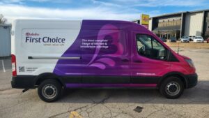
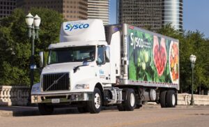
It amazes me how many businesses I visit across the country have a great brand image yet their vehicle graphics do not match. Their website looks great and is informative, and full or great information, their company uniforms are clean and professional, their business cards, letterhead and brochures are consistent, their store front sign is bright and eye catching; yet, their car, van or truck graphics are white, boring and non-noticeable.
The company director of impressions (their vehicles) not only say nothing about their company, they don’t even look like the company brand. They keep 95% of the vehicle white and then slap a small logo, website and phone number on both sides and the rear.
Why, you may ask? It’s really quite simple. This is done out of habit and comfort. They have always done it this way. And almost all of the other companies they know have done it this way too. Vehicles are a depreciating expense and they want to minimize the investment in those vehicles as much as they can. They have been in business for a long time and everything is good.
We have always done it this way are the seven most expensive words in business. Businesses need to wake up and take advantage of their free mobile billboard space and make sure their company vehicles are consistent with the rest of brand. They should match all the other business essentials they use on a daily basis.
Give us a shout and we’ll show you how incorporating fleet graphics into your marketing mix will get your business noticed. We take the hassle of fleet graphics off your plate.